# Reusable Elements Summary
## admin\_edit\_user
This reusable element allows admin Users to edit, or delete, User accounts from the application.
**Editor:**


## desktop navigation
This reusable element is used on the "logged-in" pages to allow Users to change pages.
#### Editor:

## follow button
This reusable element allows Users to follow/unfollow other Users.
#### Editor:


## footer
This reusable element is used to display the application's footer.
#### Editor:

## header\_logo\_only
This reusable element is used on pages that we don't want Users to navigate away from (e.g., reset\_pw, change\_pass, onboard).
#### Editor:

## header\_navigation
This reusable element is used on the confirm, contact, landing, privacy policy, resources, terms, and z\_layout\_no\_sidebar pages.
#### Editor:


{% hint style="info" %}
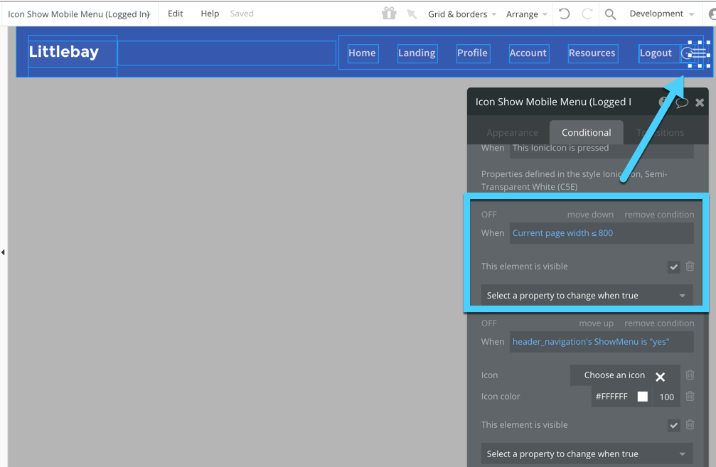
The`Icon Show Mobile Menu (Logged In)` element within the `Group Logged In` element is hidden on page load, and becomes visible when the current page width is less than or equal to 800 pixels. You can view this in the conditional formatting of that element.
 {% endhint %}

## header\_navigation\_demo
{% hint style="info" %}
This reusable element was only needed for the template's demo functionality. You don't need it; please delete it.
{% endhint %}

## image previewer
This reusable element is shown when the Current User is zooming in on one image.
#### Editor:

## login / signup popup
This reusable element is contained within the `header_navigation` reusable element, to allow Users to login and signup. It ensures that new Users' passwords meet the application's password policy when signing up. It also allows the Current User to request a password reset email.
#### Editor:


{% endhint %}

## header\_navigation\_demo
{% hint style="info" %}
This reusable element was only needed for the template's demo functionality. You don't need it; please delete it.
{% endhint %}

## image previewer
This reusable element is shown when the Current User is zooming in on one image.
#### Editor:

## login / signup popup
This reusable element is contained within the `header_navigation` reusable element, to allow Users to login and signup. It ensures that new Users' passwords meet the application's password policy when signing up. It also allows the Current User to request a password reset email.
#### Editor:


## logo (blue)
The blue version of your logo.
#### Editor:

## logo (grey)
The grey version of your logo.
#### Editor:

## logo (white)
The white version of your logo.
#### Editor:

## mobile header
The mobile header element that is shown on most of the "logged in" pages of the application, when the current page width is less than 887 pixels.
#### Editor:

## mobile menu (list)
The mobile menu of the application. This reusable element is within the `FG - Mobile Menu` elements on the application's pages.
#### Editor:


## mobile submenu
The 'icons' mobile menu of the application. This reusable element is shown beneath the `mobile header` reusable element, on most of the "logged-in" pages, when the current page width is less than 887 pixels. Customize these icons to navigate to other pages.
#### Editor:

{% hint style="info" %}
There are transparent link elements on top of the Ionic icons. To select the icons underneath the transparent link elements, click on a transparent link element and use the keyboard shortcut **Command + Click** to select the underneath icon. This saves a ton of time so you won't need to manually move or show/hide elements in order to select the elements underneath.
{% endhint %}
## user picture/dropdown
This reusable element is used on the "logged-in" pages of the application, in the top-right corner of each page. It is also contained within the mobile header reusable element to allow the Current User to easily navigate to their profile page, account page, or logout of the application.
#### Editor:

## user\_row
This reusable element element is shown in certain popups to display Users profile pictures and full names.
#### Editor:

#### Preview Example:

## Usercard (inside Group)
This reusable groupfocus element is shown when certain profile picture elements are hovered.
#### Editor:

#### Preview Example:

## userimage (20px by 20 px) and usercard
This element is currently not used on any pages, but it may be helpful when building new pages. It's used to show more information on the hovered User.
#### Editor:

#### Preview Example:

## userimage (40px by 40px) and usercard
This is a larger version of the `userimage (20px by 20px) and usercard` reusable element, to show more information about the hovered User.
#### Editor:

#### Preview Example:

 {% endhint %}

## header\_navigation\_demo
{% hint style="info" %}
This reusable element was only needed for the template's demo functionality. You don't need it; please delete it.
{% endhint %}

## image previewer
This reusable element is shown when the Current User is zooming in on one image.
#### Editor:

## login / signup popup
This reusable element is contained within the `header_navigation` reusable element, to allow Users to login and signup. It ensures that new Users' passwords meet the application's password policy when signing up. It also allows the Current User to request a password reset email.
#### Editor:


{% endhint %}

## header\_navigation\_demo
{% hint style="info" %}
This reusable element was only needed for the template's demo functionality. You don't need it; please delete it.
{% endhint %}

## image previewer
This reusable element is shown when the Current User is zooming in on one image.
#### Editor:

## login / signup popup
This reusable element is contained within the `header_navigation` reusable element, to allow Users to login and signup. It ensures that new Users' passwords meet the application's password policy when signing up. It also allows the Current User to request a password reset email.
#### Editor:


